折腾:
【未解决】基于html5up-landed的html5模板搭建网站主页
期间,需要让图片居中显示。
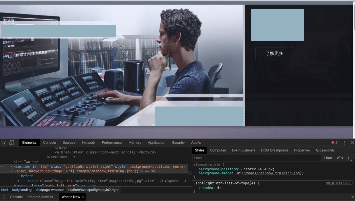
但是此处图片是:
底图,想要去适配
css image center
调试了好一会,结果由于已有的css和html太复杂,始终无法调节出我们要的效果。
又去参考
html left right layout
最后改用flex
1 2 3 4 5 6 7 8 9 10 11 12 13 14 15 16 17 18 19 20 21 | <section class="second_row"> <div class="left_parent"> <img class="left_image" src="images/rainbow_training.jpg" /> </div> <div class="right_content"> <!-- <div class="row"> --> <!-- <div class="col-4 col-12-medium">第一行</div> <div class="col-4 col-12-medium">第二行</div> --> <div class="col-4 col-12-medium">第1行</div> <div class="col-4 col-12-medium">第2行</div> <div class="col-4 col-12-medium">第3行</div> <div class="col-4 col-12-medium">第4行</div> <div>第5行</div> <div>第6行</div> <div>第7行</div> <div>第8行</div> <!-- </div> --> </div> </section> |
css
1 2 3 4 5 6 7 8 9 10 11 12 13 14 15 16 17 18 19 20 21 22 23 24 25 26 27 28 29 30 31 32 33 34 35 36 37 38 39 40 41 42 | .second_row { display: flex; padding-top: 3.5em; // width:100%; // text-align:center; // display: flex; /* establish flex container */ // flex-direction: row; /* default value; can be omitted */ // flex-wrap: nowrap; /* default value; can be omitted */ // justify-content: space-between; /* switched from default (flex-start, see below) */ // background-color: lightyellow;}.left_parent{ flex: 70%; // float: left; // width: 68%; // position: absolute; // left: 0px;}.left_image { width: 100%;}.right_content { // display: inline-block; // width: 30%; // // float: right; // // float:left; // position: absolute; // left: 30%; flex: 30%;} |
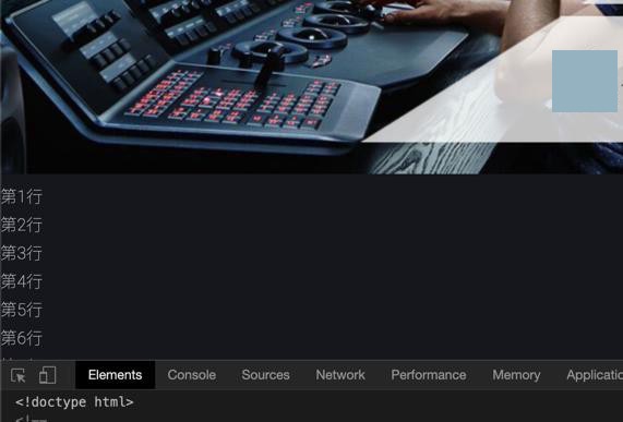
暂时实现了:
左右布局:
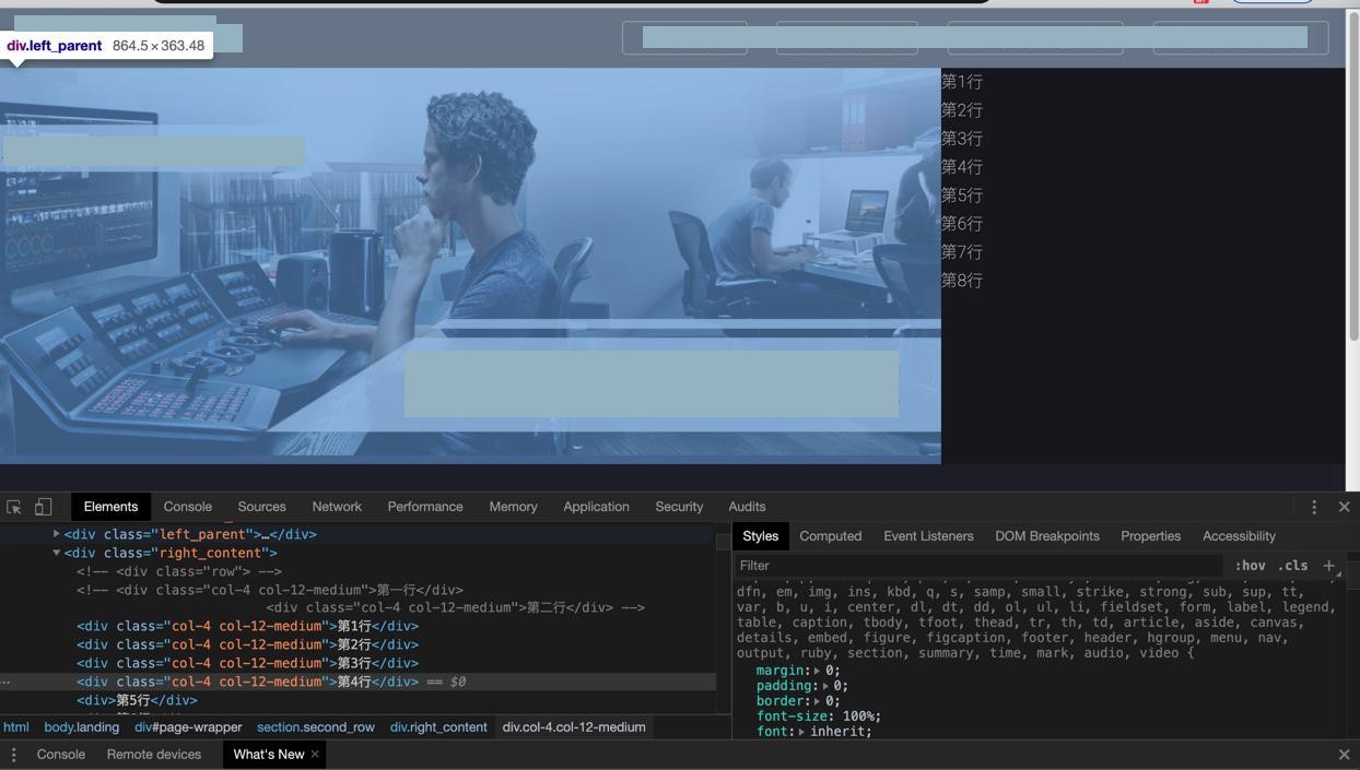
只能算凑合用。
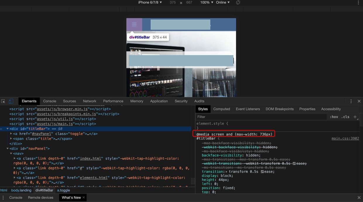
以及发现移动端无法自动适配:
需要后续想办法:
支持移动端屏幕宽度时,自动让多行在下一行显示。
其中,原先的按钮,则是支持自动适配布局的:
再去把8行的大小调节一下
不过,要去适配移动端的布局
html left right mobile to up down
结果用:
1 2 3 4 5 6 7 8 9 10 11 12 13 14 15 16 17 18 19 20 21 22 23 24 25 26 27 28 29 30 31 32 33 34 35 36 37 38 39 40 41 42 43 44 45 46 47 48 49 50 51 52 53 54 55 56 57 58 59 60 61 62 63 64 65 66 67 | @media screen and (min-width: 480x){ .second_row { display: flex; padding-top: 3.5em; // width:100%; // text-align:center; // display: flex; /* establish flex container */ // flex-direction: row; /* default value; can be omitted */ // flex-wrap: nowrap; /* default value; can be omitted */ // justify-content: space-between; /* switched from default (flex-start, see below) */ // background-color: lightyellow; } .left_parent{ flex: 70%; // float: left; // width: 68%; // position: absolute; // left: 0px; } .left_image { width: 100%; } .right_content { // display: inline-block; // width: 30%; // // float: right; // // float:left; // position: absolute; // left: 30%; flex: 30%; }}@media screen and (max-width: 480x){ .second_row { display: flex; padding-top: 3.5em; } .left_parent{ flex: 100%; } .left_image { width: 100%; } .right_content { flex: 100%; }} |
结果:
大屏时竟然也是上下布局了
算了,去参考前面的菜单的布局,是怎么自动适配的
也是类似写法
1 | @media screen and (max-width: 736px) { |
去把这部分放到这里试试
1 2 3 4 5 6 7 8 9 10 11 12 13 14 15 16 17 18 19 | .second_row { display: flex; // padding-top: 3.5em; } .left_parent{ flex: 100%; } .left_image { width: 100%; } .right_content { flex: 100%; }... |
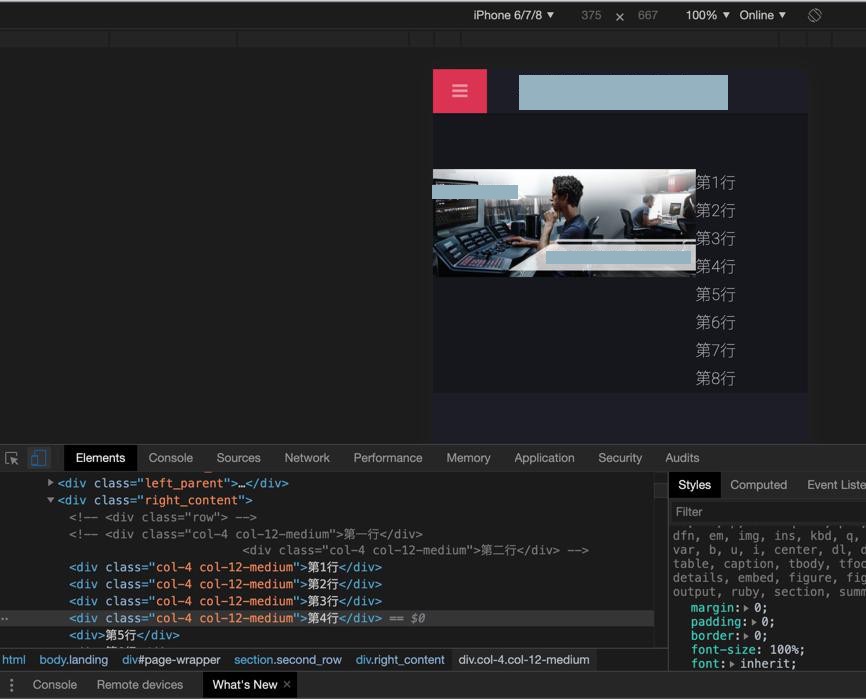
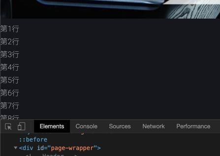
结果:
还是有问题
宽屏时,不对:
小屏时,也错了:
调试了半天,很是诡异的是,改为:
1 2 3 4 5 6 7 8 9 10 11 12 13 14 15 16 17 18 19 | .second_row { display: flex; padding-top: 3.5em;}.left_parent{ flex: 70%;}.left_image { width: 100%;}.right_content { flex: 30%;} |
然后至少大屏是OK的了。
然后再去调试小屏
【总结】
目前用:
1 2 3 4 5 6 7 8 9 10 11 12 13 14 15 16 17 18 19 20 21 22 23 24 25 26 27 28 29 30 31 32 33 34 35 36 37 38 39 40 41 42 43 44 45 46 47 48 49 50 51 52 53 54 55 56 57 58 59 60 61 62 63 64 65 66 67 68 69 70 71 72 73 74 | @media screen and (min-width: 736px) { .second_row { display: flex; padding-top: 3.5em; flex-direction: row; } .left_parent{ flex: 70%; } .left_image { width: 100%; } .right_content { flex: 30%; }} @media screen and (max-width: 736px) { .second_row { display: flex; // padding-top: 3.5em; flex-direction: column; } .left_parent{ flex: 100%; } .left_image { width: 100%; } .right_content { flex: 100%; }。。。 |
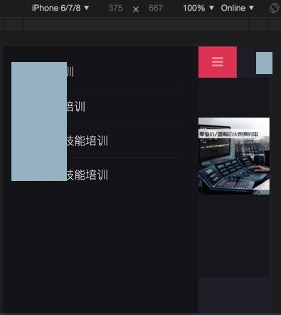
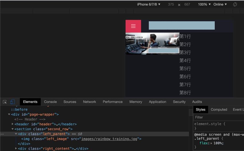
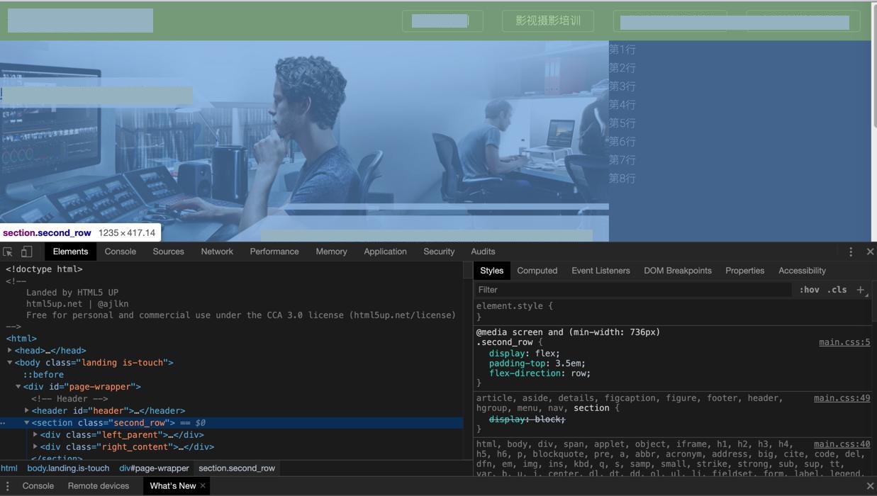
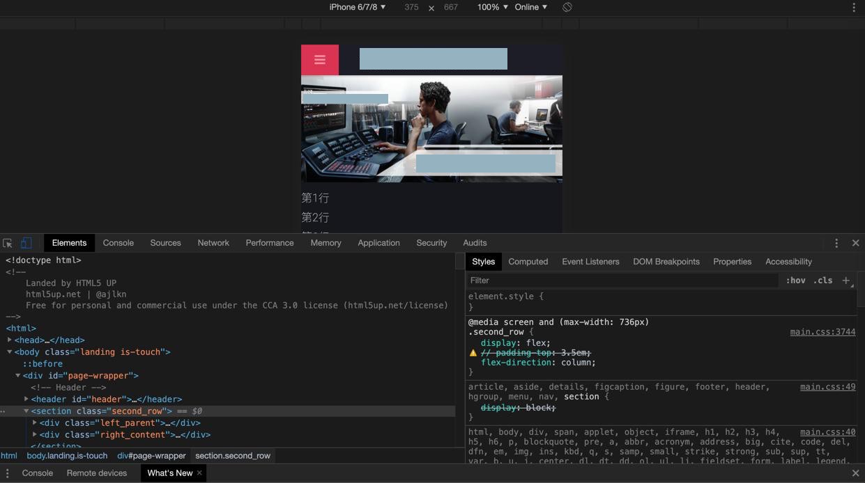
目前可以实现:
大屏左右布局:
小屏上下布局:
转载请注明:在路上 » 【已解决】html网页中实现左右布局和图片居中显示