ECharts 柱状图 带折线
【总结】
目前用:
1 2 3 4 5 6 7 8 9 10 11 12 13 14 15 16 17 18 19 20 21 22 23 24 25 26 27 28 29 30 31 32 33 34 35 36 37 38 39 40 41 42 43 44 45 46 47 48 49 50 51 52 53 54 55 56 57 58 59 60 61 62 63 64 65 66 67 68 69 70 71 72 73 74 75 76 77 78 79 80 81 82 83 84 85 86 87 88 89 90 91 92 93 94 95 96 97 98 99 100 101 102 103 104 | option = { title: { left: 'top', text: '陈岩石通话统计', show: true }, tooltip: { trigger: 'axis', formatter: '{a}:{c}', axisPointer: { type: 'cross', crossStyle: { color: '#999' } } }, // grid: { // show: false, // top: '30', // bottom: '60', // right: '60', // left: '60' // }, legend: { show: true, selectedMode: 'single', //设置显示单一图例的图形,点击可切换 bottom: 10, left: 50, textStyle: { color: '#666', fontSize: 12 }, itemGap: 20, data: ['陈岩石'], inactiveColor: '#ccc' }, xAxis: [ { type: 'category', data: [ '07/01', '07/02', '07/03', '07/04', '07/05', '07/06', '07/07', '07/08', '07/09', '07/10', '07/11', '07/12', '07/13', '07/14', '07/15', '07/16', '07/17', ], axisPointer: { type: 'shadow' }, axisTick: { show: true, interval: 0 }, } ], //设置两个y轴,左边显示数量,右边显示概率 yAxis: [{ type: 'value', name: '通话分钟', show: true, interval: 5, }, { type: 'value', name: '通话次数', min: 0, max: 20, interval: 2, axisLabel: { formatter: '{value}' } } ], //每个设备分数量、概率2个指标,只要让他们的name一致,即可通过,legeng进行统一的切换 series: [ { name: '陈岩石', type: 'bar', data: [ 70, 68, 65, 64, 60, 57, 68, 65, 64, 60, 57, 45, 40, 38, 30, 90, 80 ], barWidth: '50%', itemStyle: { normal: { color: "SlateBlue" } } }, { name: '陈岩石', type: 'line', yAxisIndex: 1, data: [14, 13, 17, 8, 9, 11, 11, 9, 15, 20, 14, 7, 8, 10, 13, 15, 16], symbolSize: 10, itemStyle: { normal: { color: "Fuchsia" } } }, ]}; |
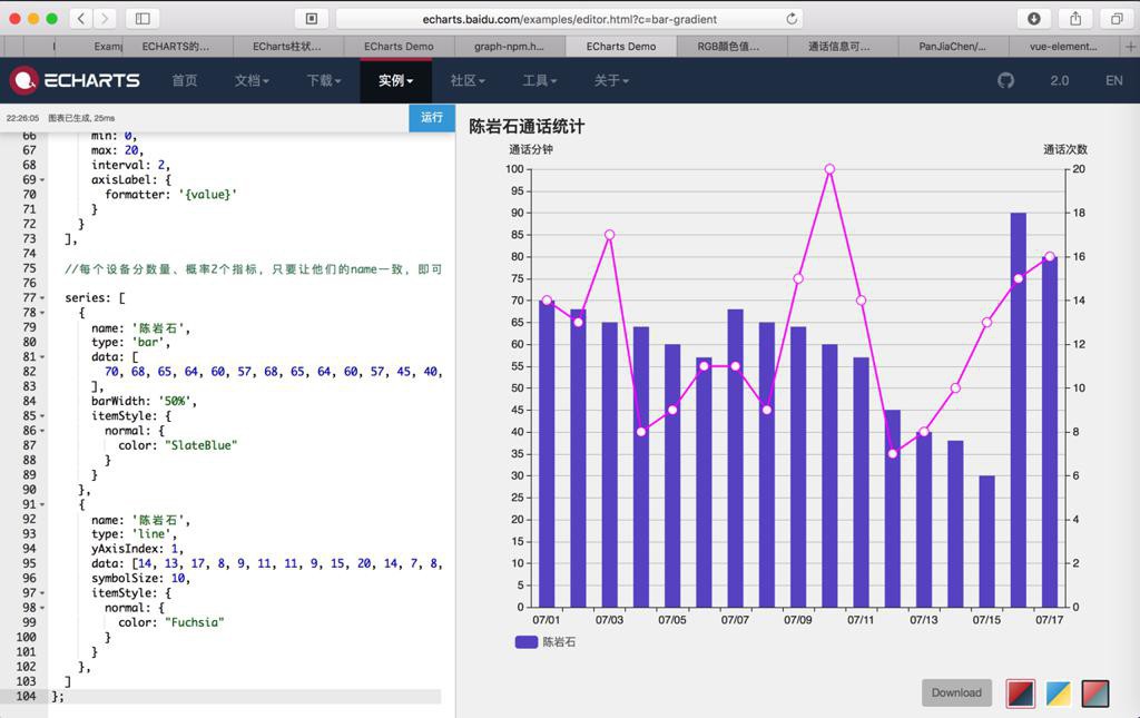
效果:
转载请注明:在路上 » 【已解决】ECharts 柱状图 带折线