【背景】
尝试用easyUI:
中的:
Panel
http://www.jeasyui.com/demo-mobile/main/index.php?plugin=Panel&theme=metro-gray&dir=ltr&pitem=
去实现编辑的html内容,在手机上预览显示。
【折腾过程】
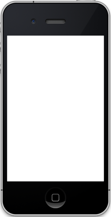
1.先去拿到背景图片:
http://www.jeasyui.com/demo-mobile/images/phone.png
再去找个单独的html去测试。
2.网上随便下载了个页面
单独打开效果是:

然后用如下代码:
1 2 3 4 5 6 7 8 9 10 11 12 13 14 15 16 17 18 19 20 21 22 23 24 25 26 27 28 | <!doctype html><html><head> <meta charset="UTF-8"> <meta name="viewport" content="initial-scale=1.0, maximum-scale=1.0, user-scalable=no"> <title>HTML页面编辑手机端预览测试</title> <link rel="stylesheet" type="text/css" href="lib/easyui/themes/metro/easyui.css"> <link rel="stylesheet" type="text/css" href="lib/easyui/themes/mobile.css"> <link rel="stylesheet" type="text/css" href="lib/easyui/themes/icon.css"> <script type="text/javascript" src="lib/easyui/jquery.min.js"></script> <script type="text/javascript" src="lib/easyui/jquery.easyui.min.js"></script> <script type="text/javascript" src="lib/easyui/jquery.easyui.mobile.js"></script></head><body> <div class="easyui-navpanel" data-options="href:'input_html_demo.html'" style="padding:10px"> <header> <div class="m-toolbar"> <div class="m-title">Ajax Panel</div> </div> </header> <footer> <div class="m-toolbar"> <div class="m-title">Panel Footer</div> </div> </footer> </div></body> </html> |
放在里面效果是:

3.尝试去加上对应的背景图片:
把:
Ajax Panel – Live Demo – jQuery EasyUI
中的源码:
1 2 3 4 5 6 7 8 9 10 11 12 13 14 15 16 17 | <styletype="text/css"> .device{ width: 400px; height: 760px; margin:10px 0 0 170px; background:url('../images/phone.png') no-repeat; position:relative; } .demo-wrap{ position:absolute; width:322px; height:482px; background: #ccc; top:117px; left:23px; }</style> |
拷贝过来:
再去试试:
1 2 3 4 5 6 7 8 9 10 11 12 13 14 15 16 17 18 19 20 21 22 23 24 25 26 27 28 29 30 31 32 33 34 35 36 37 38 39 40 41 42 43 44 45 46 | <!doctype html><html><head> <meta charset="UTF-8"> <meta name="viewport" content="initial-scale=1.0, maximum-scale=1.0, user-scalable=no"> <title>HTML页面编辑手机端预览测试</title> <link rel="stylesheet" type="text/css" href="lib/easyui/themes/metro/easyui.css"> <link rel="stylesheet" type="text/css" href="lib/easyui/themes/mobile.css"> <link rel="stylesheet" type="text/css" href="lib/easyui/themes/icon.css"> <script type="text/javascript" src="lib/easyui/jquery.min.js"></script> <script type="text/javascript" src="lib/easyui/jquery.easyui.min.js"></script> <script type="text/javascript" src="lib/easyui/jquery.easyui.mobile.js"></script> <style type="text/css"> .device{ width: 400px; height: 760px; margin:10px 0 0 170px; background:url('images/phone.png') no-repeat; position:relative; } .demo-wrap{ position:absolute; width:322px; height:482px; background: #ccc; top:117px; left:23px; } </style></head><body> <div class="easyui-navpanel" data-options="href:'input_html_demo.html'" style="padding:10px"> <header> <div class="m-toolbar"> <div class="m-title">Ajax Panel</div> </div> </header> <footer> <div class="m-toolbar"> <div class="m-title">Panel Footer</div> </div> </footer> </div></body> </html> |
结果显示效果没变化。
4.把路径都改为上一级的目录:
1 2 3 4 5 6 | <link rel="stylesheet" type="text/css" href="../lib/easyui/themes/metro/easyui.css"> <link rel="stylesheet" type="text/css" href="../lib/easyui/themes/mobile.css"> <link rel="stylesheet" type="text/css" href="../lib/easyui/themes/icon.css"> <script type="text/javascript" src="../lib/easyui/jquery.min.js"></script> <script type="text/javascript" src="../lib/easyui/jquery.easyui.min.js"></script><script type="text/javascript" src="../lib/easyui/jquery.easyui.mobile.js"></s |
结果是:

只显示文字了,其他内容都不显示了。。。
5.后来又经过N多次的折腾,结果都还是显示乱码,或者异常。
6.最后的最后,终于用如下代码:
1 2 3 4 5 6 7 8 9 10 11 12 13 14 15 16 17 18 19 20 21 22 23 24 25 26 27 28 29 30 31 32 33 34 35 36 37 38 39 40 41 42 43 44 45 46 47 48 49 50 51 52 53 | <!doctype html><html><head> <meta charset="UTF-8"> <meta name="viewport" content="initial-scale=1.0, maximum-scale=1.0, user-scalable=no"> <title>HTML页面编辑手机端预览测试</title> <link rel="stylesheet" type="text/css" href="lib/easyui/themes/metro/easyui.css"> <link rel="stylesheet" type="text/css" href="lib/easyui/themes/mobile.css"> <link rel="stylesheet" type="text/css" href="lib/easyui/themes/icon.css"> <script type="text/javascript" src="lib/easyui/jquery.min.js"></script> <script type="text/javascript" src="lib/easyui/jquery.easyui.min.js"></script> <script type="text/javascript" src="lib/easyui/jquery.easyui.mobile.js"></script> <style type="text/css"> .device{ width: 400px; height: 760px; margin:10px 0 0 170px; background:url('images/phone.png') no-repeat; position:relative; } .demo-wrap{ position:absolute; width:322px; height:482px; background: #ccc; top:117px; left:23px; } </style></head><body> <div class="device"> <div class="demo-wrap"> <div class="easyui-navpanel" data-options="href:'input_html_demo.html'" style="padding:10px"> <header> <div class="m-toolbar"> <div class="m-title">页面预览效果</div> </div> </header> <footer> <div class="m-toolbar"> <div class="m-title">xxxx系统</div> </div> </footer> </div> </div> </div></body> </html> |
实现了预览效果:

7.后来发现,对于easyUI,下载的源码包中,包含了所有的demo,包括此处这个demo。
其中就有对应的那些源码和测试文件_content.html

把对应的_content.html拿过来:

用代码:
1 | <div class="easyui-navpanel" data-options="href:'_content.html'" style="padding:10px"> |
就可以看到官网demo的效果了:

【总结】
其实本来这个事情很简单,只要熟悉div的class设置值,然后再用css控制这个class即可。
只不过由于之前没这么弄过,并且细节参数不会调,所以折腾了很长时间才弄好。
最终才借用官网的参数配置,尤其是各种padding,px等等,才弄出来的。